The first project for BA Textiles Design (Printed Textiles) is Alpine, for this module we'll be exploring the trend of Alpine for Autumn/Winter 13/14. This trend is all about embracing nature and the great outdoors, warm and cool moods are created with a Woodland palette, playful and down to earth imagery.
Key points I will be exploring for this project are:
Rustic elements inspire finishes on hard surfaces- I enjoy manipulating the surfaces of materials and changing their properties.
Natural aesthetic, bringing the outdoors indoors- I like being around nature, peaceful walks, sitting in a park, cycling through woodland areas.
For this project I really want to connect with the colour palette, find and take photographs that reflect the Alpine colours. Those are images I found and picked out the colours that reflect the Alpine trend.
Showing posts with label Colour. Show all posts
Wednesday, 26 September 2012
Saturday, 15 October 2011
first rotation: weaving
Tuesday, 13 September 2011
Carolina Herrera Spring 2012 RTW
As the time draws nearer to my Textiles Design course start date, more ideas for projects and flowing in. So Im doing my best to write them down here on my blog so I can refer back to them later. I saw a tweet about Carolina Herrera's Spring 2012 RTW collection so I decided to look it up out of curiosity.
There were a few garments that really stood out to me and sparked some inspiration so here are a few

There were a few garments that really stood out to me and sparked some inspiration so here are a few
While clicking through the images in the slideshow the garment above reminded me of a blurry photo I took in Jamaica of a Hummingbird, especially the layers on the bottom of the dress, the fabric is so light and delicate like the wingd of the Hummingbird. There is so much movement in the bottoms layers and the colours are so tropical and similar to the Hummingbird colours. This is definately a garment I would like to draw inspiration from.

This is also another garment from the slideshow that caught my attention.
The prints on silk/chiffon are so simple but works well with the colour and delicate fabric.
I know first hand how beautiful prints on chiffon are and they dye beautiful colour shades.
This dress also made me think of my blurry Hummingbird photograph from Jamaica. Although
the print is of little sparrows. I think if I were to use my blurry photograph as a print I would like to keep the blurred quality of the photograph and print it repeatedly on chiffon or silk like Herrera.
Here is the link to her collection on style.com
http://www.style.com/fashionshows/review/S2012RTW-CHERRERA
Sunday, 14 August 2011
Atsuko Tanaka: The Art of Connecting 13.08.11
Art- the conscious production or arrangement of sounds, colours, forms, movements or other elements in a manner that affects the sense of beauty
Connecting- join or fasten
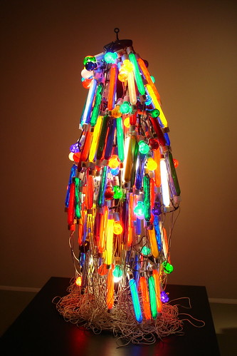
I've chosen these two definitions to help myself clarify the whole idea of this exhibition. Atsuko Tanaka is a Japanese avant-garde artist, in my opinion Tanaka's work fits the definition of avant-garde art. Her work is extremely experimental as she uses a wide variety of materials to create work that blurs the lines between painting, sculpture and performance art. Walking into the exhibition the smell of freshly painted walls fills the room while Tanaka's work awaits. Her body of work varied from minimal large rectangles of dyed cotton cloth to complex in composition large paintings. For me it was her large colourful and complex paintings that were most engaging and inspiring along with the Electric Dress (1956).
Both the Electric Dress and paintings of vivid lines and circles works well in the exhibition space. I like that the Electric Dress was placed in the centre of the room surrounded by the large paintings as they were analogous in function.
When the dress lit up I immediately thought of modern day Japan, Tokyo a busy city with blazing neon signs all connected by neatly hidden electric wires. The fact that the wires on the Electric Dress aren't hidden echos the title of the exhibition 'The Art of Connecting' which is also apparent in her large vivid paintings which shows the complex connection of circles and lines veering in different directions but always connecting. This also allows you to open your mind and absorb all the colours in the paintings.
Although Tanaka's work was a few years before the Pop Art movement but I can see
the Electric Dress being displayed in Pop Art exhibition along with works from Roy Rauschenberg and Andy Warhol.
Speaking to the invigilator of the exhibition about this he, also echoed my thoughts by saying Japan was also involved in the second World War.
the Electric Dress being displayed in Pop Art exhibition along with works from Roy Rauschenberg and Andy Warhol.
Speaking to the invigilator of the exhibition about this he, also echoed my thoughts by saying Japan was also involved in the second World War.
This immediately made another link with Tanaka's work to the Pop Art culture, Bell is a sound installation consisting of 20 electric bells wired together at two-metre intervals.
This sound installation if exhibited during the Pop Art movement could ranslate into the sound of terror, the sound of bomb warning sirens going off to warn people of attack.
This was when real inspiration hit me. The circles in Tanaka's paintings were all different sizes and colours. The lines act as support that connects them. So I thought I could use these paintings and translate them in my own work by using different textures and colours of wool. I thought of wool because you can get a variety to work with which should create interesting lines like in the paintings. For the circles I though those could be represented by various sized pompom wool balls.
Atsuko Tanaka
The Art of Connecting
Ikon July- September 2011
Free Entry
Saturday, 25 June 2011
Inspiration 1: Lisanne de Jong by Viviane Sassen for Dazed & Confused July 2011
This shoot is so inspirational for the colourful hippie inside me.
The location for this shoot complements the garments so well.
The model really works these garments to make the look like flowers
in bloom.
The location for this shoot complements the garments so well.
The model really works these garments to make the look like flowers
in bloom.


Images found on: Fashion Gone Rogue via Bloglovin
Thursday, 6 January 2011
Fashion Illustrator: Stina Persson


I've only recently discovered her work, but it's so exciting. Stina Persson is a fashion illustrator based in Sweden, Stockholm. Her work really appeals to me because of the bright beautiful colours she uses, I love illustrations with bright colours. Her work is slightly similar to David Downton but she uses more colours in her work making it look more complex.
Her water colour works are just amazing! This is definitely something I will try out!
Her website has more of her exciting and beautiful work http://www.stinapersson.com/
Sunday, 4 April 2010
Kandinsky inspires me
For my Art exam project one of my influences are Wassily Kandinsky. His work is so inspiring, I love the way he compares music to art, this is something I usually do. Whenever I watch an interesting music video an idea for a drawing or design usually sparks in my head.
Colour is the keyboard, the eyes are the hammers, the soul is the piano with its many chords. The artist is the hand that, by touching this or that key, sets the soul vibrating automatically. (Wassily Kandinsky)
Subscribe to:
Posts (Atom)
Labels
Fashion
(33)
Textiles
(17)
Art
(9)
Bournville
(9)
Sewing
(8)
final major project
(8)
Colour
(7)
Prints
(6)
Inspiration
(5)
Photography
(5)
Aqua-film
(4)
Designs
(4)
Illustration
(4)
Atsuko Tanaka
(3)
Caribbean
(3)
Exam
(3)
Fabrics
(3)
Fashion Designer
(3)
Quilting
(3)
Vogue
(3)
nature
(3)
project
(3)
Black and White
(2)
Creative
(2)
Drawing
(2)
Hexagons
(2)
Ikon
(2)
Jamaica
(2)
Japanese
(2)
Knit
(2)
Love
(2)
Paint
(2)
Paintings
(2)
Sketches
(2)
Stitches
(2)
Styles
(2)
Summer
(2)
Trends
(2)
catwalk
(2)
flowers
(2)
headscarves
(2)
junya watanabe
(2)
organza
(2)
textiles design
(2)
40s and 50s pin-up
(1)
70s print
(1)
Alfred Eisenstaedt
(1)
Alpine
(1)
BA Visual Arts by negotiated study degree show
(1)
BCU
(1)
Betty Grable
(1)
Book
(1)
Bored
(1)
Britain's Got Talent
(1)
Carolina Herrara
(1)
Company Magazine
(1)
Composition
(1)
Confident
(1)
Constructed Textiles
(1)
David Downton
(1)
Degree
(1)
Disappointment
(1)
Elle magazine
(1)
Embriodery
(1)
Fate
(1)
Free-hand machine foot
(1)
Friends
(1)
Holiday
(1)
Hope
(1)
Interior Design
(1)
Kandinsky
(1)
LOL
(1)
Marilyn Monroe
(1)
Marios Scwab
(1)
Mary Katranzou
(1)
Monday
(1)
Music
(1)
Native American
(1)
New Year
(1)
Pefectionist
(1)
Pencil
(1)
Random
(1)
Reflection
(1)
Research
(1)
Sandra Buckland
(1)
Scrap
(1)
Spring
(1)
Stina Persson
(1)
Tobias Mead
(1)
University work
(1)
V-J Day
(1)
Water colour
(1)
Wedding Dresses
(1)
Yanii
(1)
analogue photography
(1)
bloglovin
(1)
crinoline
(1)
editorial
(1)
etsy
(1)
exhibition
(1)
gifts
(1)
handmade
(1)
identity
(1)
imagery
(1)
it
(1)
lomography
(1)
lookbook
(1)
media
(1)
minimal
(1)
mixed-media
(1)
portfolio
(1)
positive
(1)
school
(1)
screen print
(1)
shopping
(1)
sketchbook
(1)
snow
(1)
stress
(1)
textures
(1)
underestimate
(1)
vintage
(1)
volunteering
(1)
weave
(1)
world issues
(1)