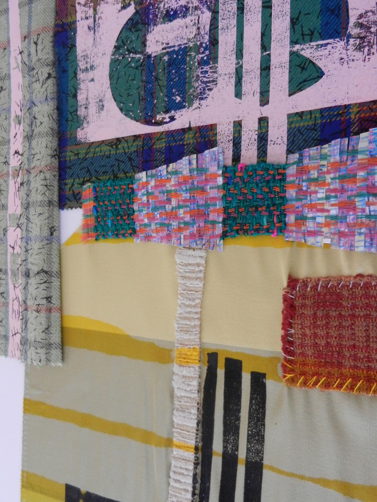
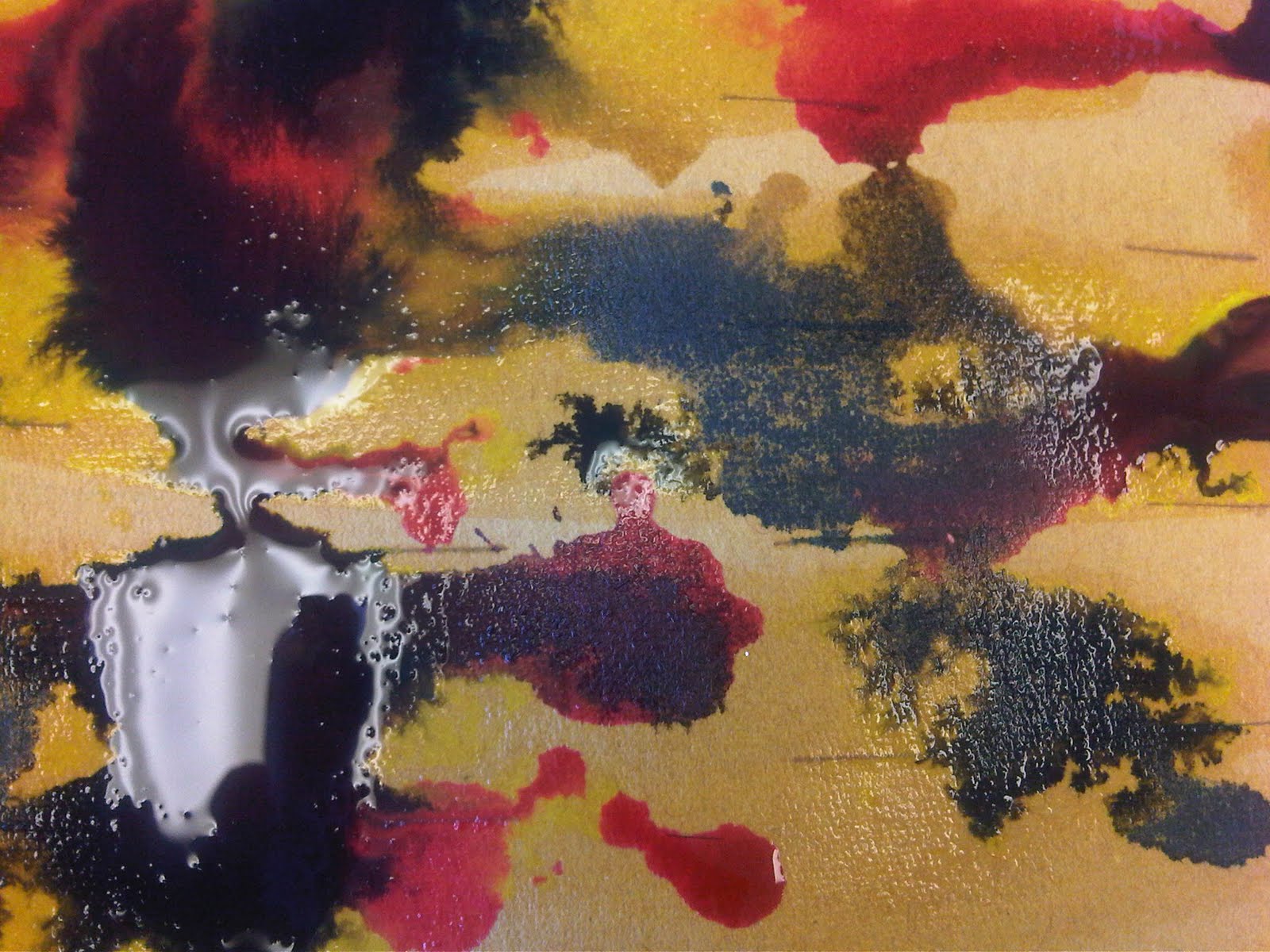
The first project for BA Textiles Design (Printed Textiles) is Alpine, for this module we'll be exploring the trend of Alpine for Autumn/Winter 13/14. This trend is all about embracing nature and the great outdoors, warm and cool moods are created with a Woodland palette, playful and down to earth imagery.
Key points I will be exploring for this project are:
Rustic elements inspire finishes on hard surfaces- I enjoy manipulating the surfaces of materials and changing their properties.
Natural aesthetic, bringing the outdoors indoors- I like being around nature, peaceful walks, sitting in a park, cycling through woodland areas.
For this project I really want to connect with the colour palette, find and take photographs that reflect the Alpine colours. Those are images I found and picked out the colours that reflect the Alpine trend.
Wednesday, 26 September 2012
Exhibition: Style Africa
Birmingham Museum & Art Gallery (and students from Birmingham City University) has been hosting the Style Africa exhibition throughout the summer to autumn. Once I finally got the chance to visit and indulge in some world Textiles, I was immediately drawn to the exciting colours and narrative prints on display. There were large panels of cloth printed and dyed from various countries in Africa, they all told stories about live and textiles techniques native to their country.
Here are some photographs from my visit.
Monday, 13 August 2012
Lomography
Ever since they came out, Lomo cameras have always caught my eye. Now I'm thinking about treating myself to one for my 21st birthday in October. This is the camera I would like to be my starter and then maybe I will move onto to something more technical when I've learn more about analogue photography.
This is a pretty big investment though as I have t consider developing prices and film costs, but I love analogue photography so the price shouldn't be a big issue.

The Diana F+ in Neptune green
This is a pretty big investment though as I have t consider developing prices and film costs, but I love analogue photography so the price shouldn't be a big issue.
The Diana F+ in Neptune green
Sunday, 12 August 2012
Most recent work
These are a few images of my work from my first year at University. At the beginning of the year I quite experimental in my approach to projects, and would work with anything. But towards the end I began to be more selective with my research material, research from unconventional sources such as films, finding materials and textures that interested me. Materials I mainly worked with were found materials in the scrap box (my favorite place to find fabrics), satin is so wonderful with heat transfer process, wallpaper painted with heat transfer dyes create exciting textured prints and Dercolin (for bleaching fabrics). I've had the most exciting year studying Textiles Design and I am thoroughly looking forward to going back in September.


Monday, 12 December 2011
Busy, Timid, Colouful identity of Yanique Moodie
I've completed to first module of my Textiles Design course this year, it's been such an exciting module and has kept me very busy but I feel my more is so much more personal which is good because the title of the module is Identity.
My three focus words for this module were busy, timid and colourful and I've tried to reflect these words through my work in the different specialist areas, Constructed Textiles, Embroidery and Print.
Yanique Moodie Design Boards, 2011
Textiles Design
Module TEX 4001
Birmingham City University
Textiles Design
Module TEX 4001
Birmingham City University
Saturday, 15 October 2011
first rotation: weaving
Friday, 30 September 2011
who is yanii?
Our first module in Textiles is all about Identity, defining yourself through your work and making your personality shine through your work. It's a great concept for promoting originality in our work but I've never had to define my identity through my drawings, and the drawing exercises weren't your generic pencil, paint detailed drawings. Our tutors wanted us to use three words we use to describe yourselves and draw in the style of the words. The three words I chose were timid, busy and colourful. Here are a few snapshots of my week of drawing.
Day 1:- Signatures


Day 1:- Signatures


On Monday were were using our signature to generate patterns, by writing
our name repeatedly and overlapping it each time. I actually really enjoyed this
but when we started to use this technique to generate drawings it was a bit hard to find
our name repeatedly and overlapping it each time. I actually really enjoyed this
but when we started to use this technique to generate drawings it was a bit hard to find
a comfort zone. But I managed to grasp the concept when I started to layer my signature
on my drawings using different media. The most successful drawing was the parrot, layering with
paint and my signature.
Day 2:- Making textures


Making different textures was something I really enjoyed and I think shows my identity more than the drawings with my signatures. We were given blank pieces of paper and were free to make different textures on the surface of the paper using any media of our choice. For me this was like printmaking so ideas flowed smoothly, especially when I found one technique that I could develop in many ways. I mostly worked with inks, a craft knife and paints. The textured papers also worked well when I started to cut shapes into it. For some reason I wanted to cut them into circles and layer them.
So this is what I've been working on during my first week of university.
Subscribe to:
Posts (Atom)
Labels
Fashion
(33)
Textiles
(17)
Art
(9)
Bournville
(9)
Sewing
(8)
final major project
(8)
Colour
(7)
Prints
(6)
Inspiration
(5)
Photography
(5)
Aqua-film
(4)
Designs
(4)
Illustration
(4)
Atsuko Tanaka
(3)
Caribbean
(3)
Exam
(3)
Fabrics
(3)
Fashion Designer
(3)
Quilting
(3)
Vogue
(3)
nature
(3)
project
(3)
Black and White
(2)
Creative
(2)
Drawing
(2)
Hexagons
(2)
Ikon
(2)
Jamaica
(2)
Japanese
(2)
Knit
(2)
Love
(2)
Paint
(2)
Paintings
(2)
Sketches
(2)
Stitches
(2)
Styles
(2)
Summer
(2)
Trends
(2)
catwalk
(2)
flowers
(2)
headscarves
(2)
junya watanabe
(2)
organza
(2)
textiles design
(2)
40s and 50s pin-up
(1)
70s print
(1)
Alfred Eisenstaedt
(1)
Alpine
(1)
BA Visual Arts by negotiated study degree show
(1)
BCU
(1)
Betty Grable
(1)
Book
(1)
Bored
(1)
Britain's Got Talent
(1)
Carolina Herrara
(1)
Company Magazine
(1)
Composition
(1)
Confident
(1)
Constructed Textiles
(1)
David Downton
(1)
Degree
(1)
Disappointment
(1)
Elle magazine
(1)
Embriodery
(1)
Fate
(1)
Free-hand machine foot
(1)
Friends
(1)
Holiday
(1)
Hope
(1)
Interior Design
(1)
Kandinsky
(1)
LOL
(1)
Marilyn Monroe
(1)
Marios Scwab
(1)
Mary Katranzou
(1)
Monday
(1)
Music
(1)
Native American
(1)
New Year
(1)
Pefectionist
(1)
Pencil
(1)
Random
(1)
Reflection
(1)
Research
(1)
Sandra Buckland
(1)
Scrap
(1)
Spring
(1)
Stina Persson
(1)
Tobias Mead
(1)
University work
(1)
V-J Day
(1)
Water colour
(1)
Wedding Dresses
(1)
Yanii
(1)
analogue photography
(1)
bloglovin
(1)
crinoline
(1)
editorial
(1)
etsy
(1)
exhibition
(1)
gifts
(1)
handmade
(1)
identity
(1)
imagery
(1)
it
(1)
lomography
(1)
lookbook
(1)
media
(1)
minimal
(1)
mixed-media
(1)
portfolio
(1)
positive
(1)
school
(1)
screen print
(1)
shopping
(1)
sketchbook
(1)
snow
(1)
stress
(1)
textures
(1)
underestimate
(1)
vintage
(1)
volunteering
(1)
weave
(1)
world issues
(1)